
What are the meanings behind logo colors? And how do these colors affect your target audience?
Colors really say a lot about your company and can affect how your clients think about your business. When used to their full potential, colors can influence emotions, encourage an action, or even stimulate the appetite. The colors you choose will play a vital role in effectively expressing your business through branding.
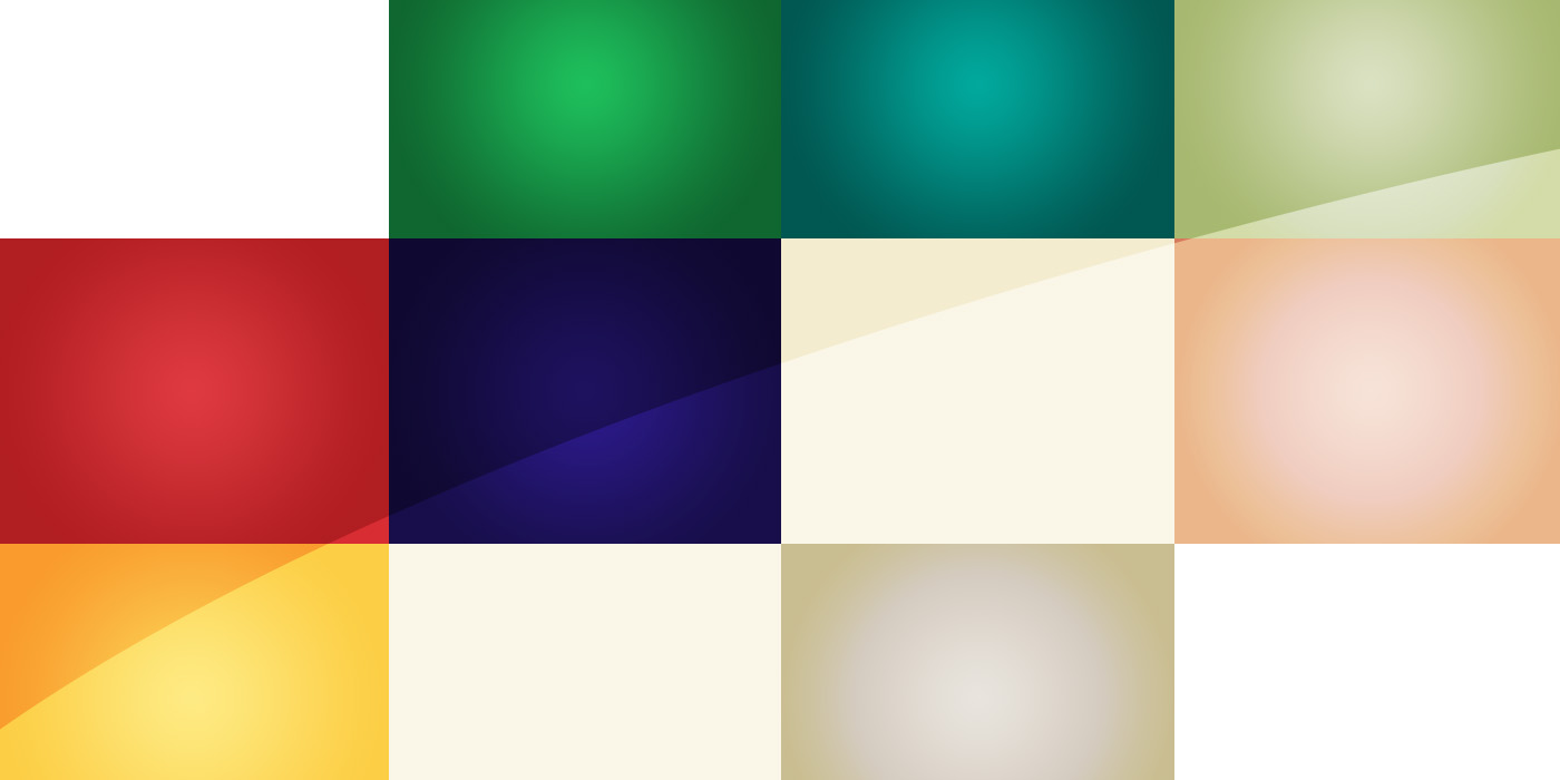
What are your logo colors saying about your business?
Red = Bold, Exciting
Red conveys intensity, urgency, or agression. It is often used to stimulate the appetite, or to express the need to take action quickly. Fast food restaurants and clearance aisles are good examples of businesses putting red to work.
Orange = Friendly, Energetic
Orange is considered a more subtle form of red. It is associated with confidence and youthfulness, and often suggests creativity, friendliness, affordability, and energy. Payless Shoe Source and Nickelodeon use orange well in their designs.
Yellow = Optimism, Warmth
Yellow is often associated with warmth and sunshine, and can imply youth, optimism and friendliness. If you take a look at McDonalds or Burger King, you’ll see that yellow is often used with red as an appetite stimulator. But take care with yellow- it can also connote caution, cowardice, or arrogance.
Green = Peace, Health
Green is associated with life and nature. It is a soothing color that brings feelings of peace, relaxation, and calmness. Green has also become the predominant color for the eco-friendly movement.
Blue = Trust, Security
Blue is a favorite for logo and brand design. It’s expresses friendliness, tranquility, and cleanliness and brings feelings of security and trust. Blue can be a great choice for almost any business- you’ll see it used in everything from banks and hospitals to social media platforms and toothbrush companies.
Purple = Imaginative, Wise
Purple suggests creativity, richness, and fantasy. It is also often associated with wisdom, power and royalty.
Pink = Feminine, Love
Pink conveys femininity, love and sweetness. It’s most commonly used with products and services that cater predominantly to women.
White = Purity
White indicates purity, innocence and cleanliness. It is often used to portray childhood or identify bridal industries.
Black = Formality, Simplicity
Black is highly versatile and can take a lot of different directions- simplicity or sophistication, usability or mystery. However, black is also commonly related with death, fear, or strictness.
Brown = Simplicity, Stability
Brown signifies simplicity, earthiness, and stability. It is often associated with the warmth of the earth, and goes well with green to showcase eco-friendliness.

One Comment